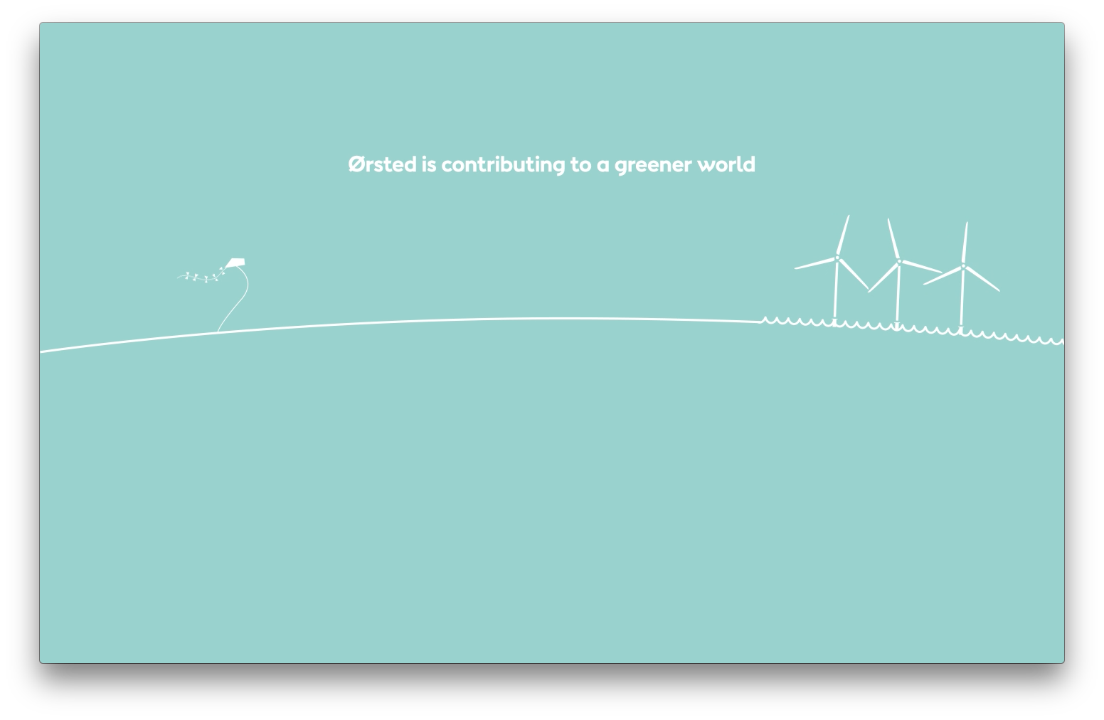
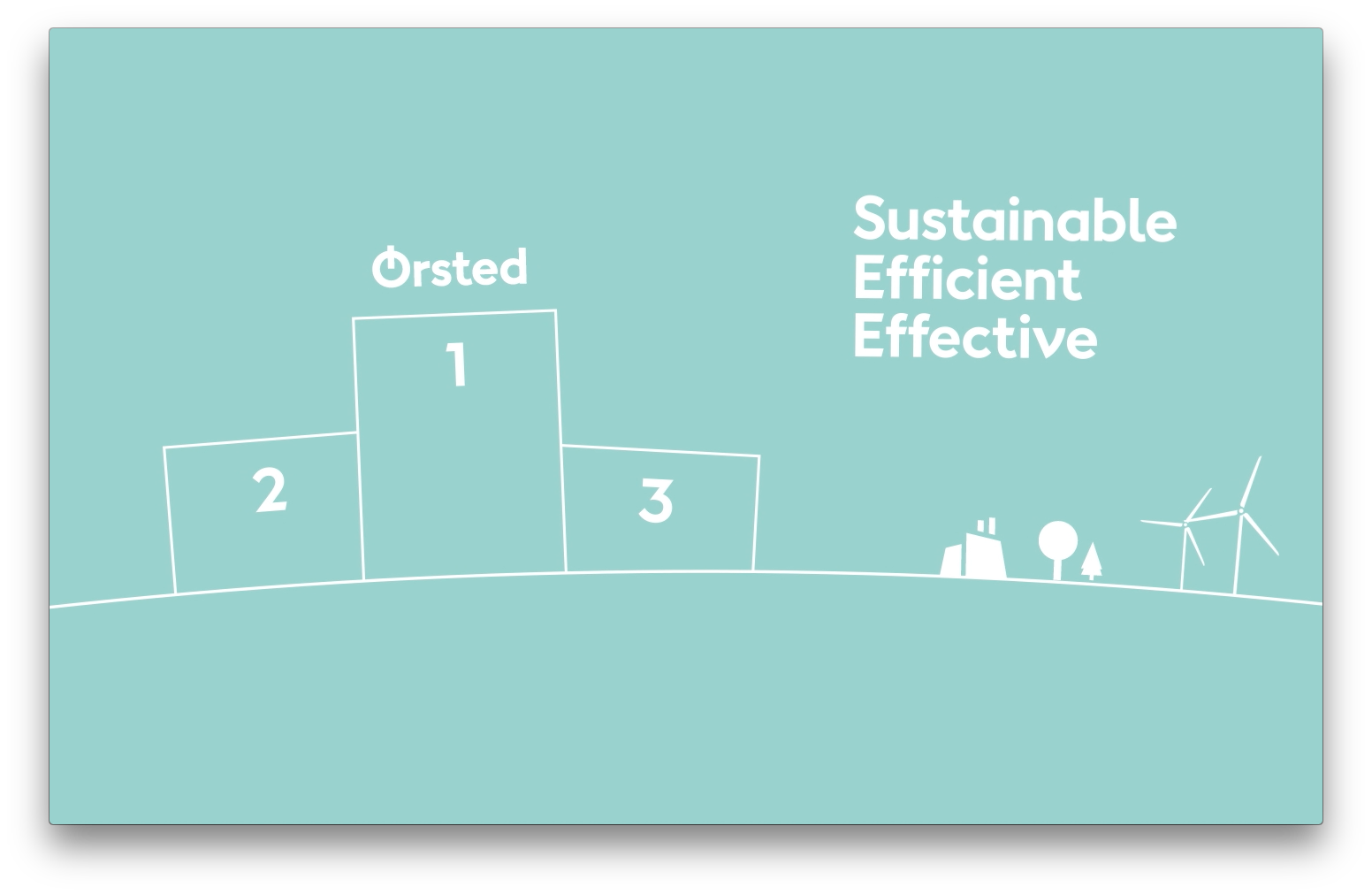
Ørsted is a large Danish energy provider, that in 2017 converted itself from "black energy" provider "Dong" to the world influence seeking green energy promoter with the modern climate politically correct attitude we know today. "QHSE" means "Quality, Health, Safety and Environment". The Ørsted QHSE induction is a series of videos and reflection encouraging digital exercises that every new Ørsted and Ørsted contractor employee must go through in order to understand Ørsted's core values regarding Quality, Health, Safety and Environment. CEO Henrik Ørsted presents the QHSE induction in a 2 minute introduction.
The entire show is a 30 minute journey conveyed through Ørsted's learning management system. Quite a few people were involved making this happen. On my team (at Cadpeople) we were at least 7. From Ørsted, there were teams involved from each of the QHSE departments of 3-5 people each to provide content and to make sure each topic was presented in coherence with the values it represents.
I'm just showing a few stills, graphics from the exercises and some UI designs.
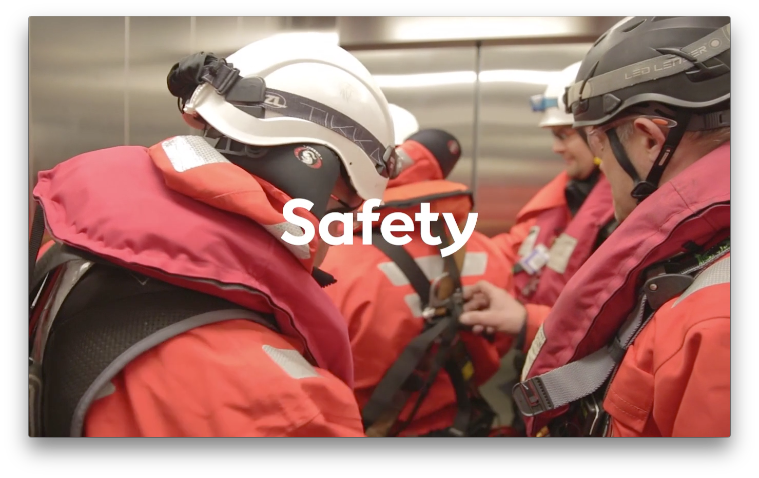
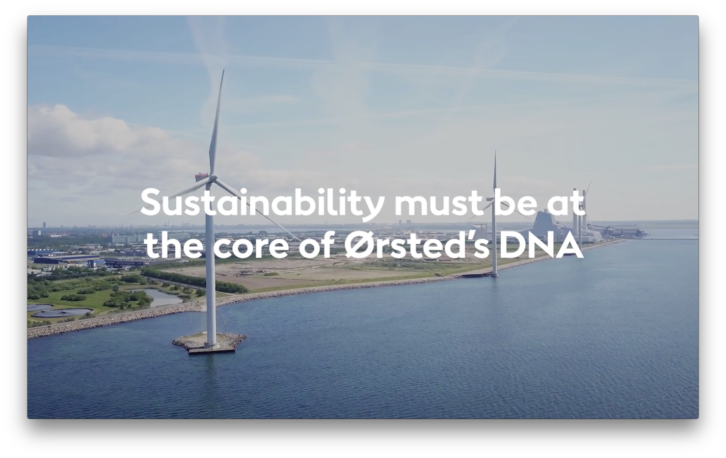
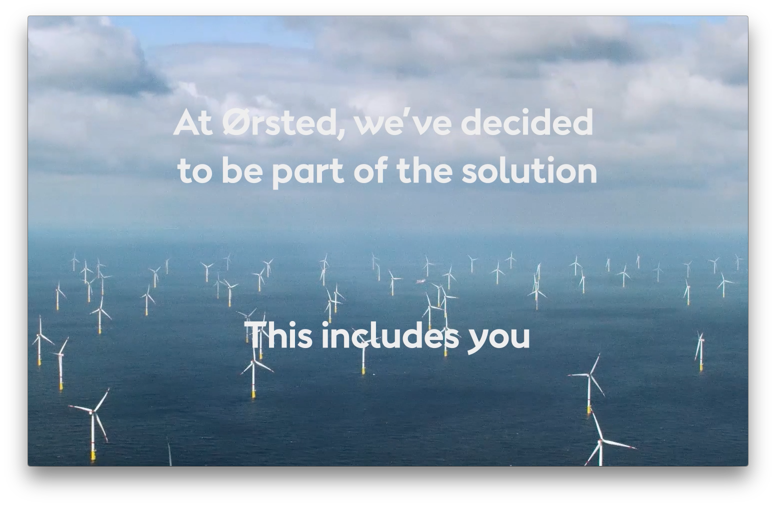
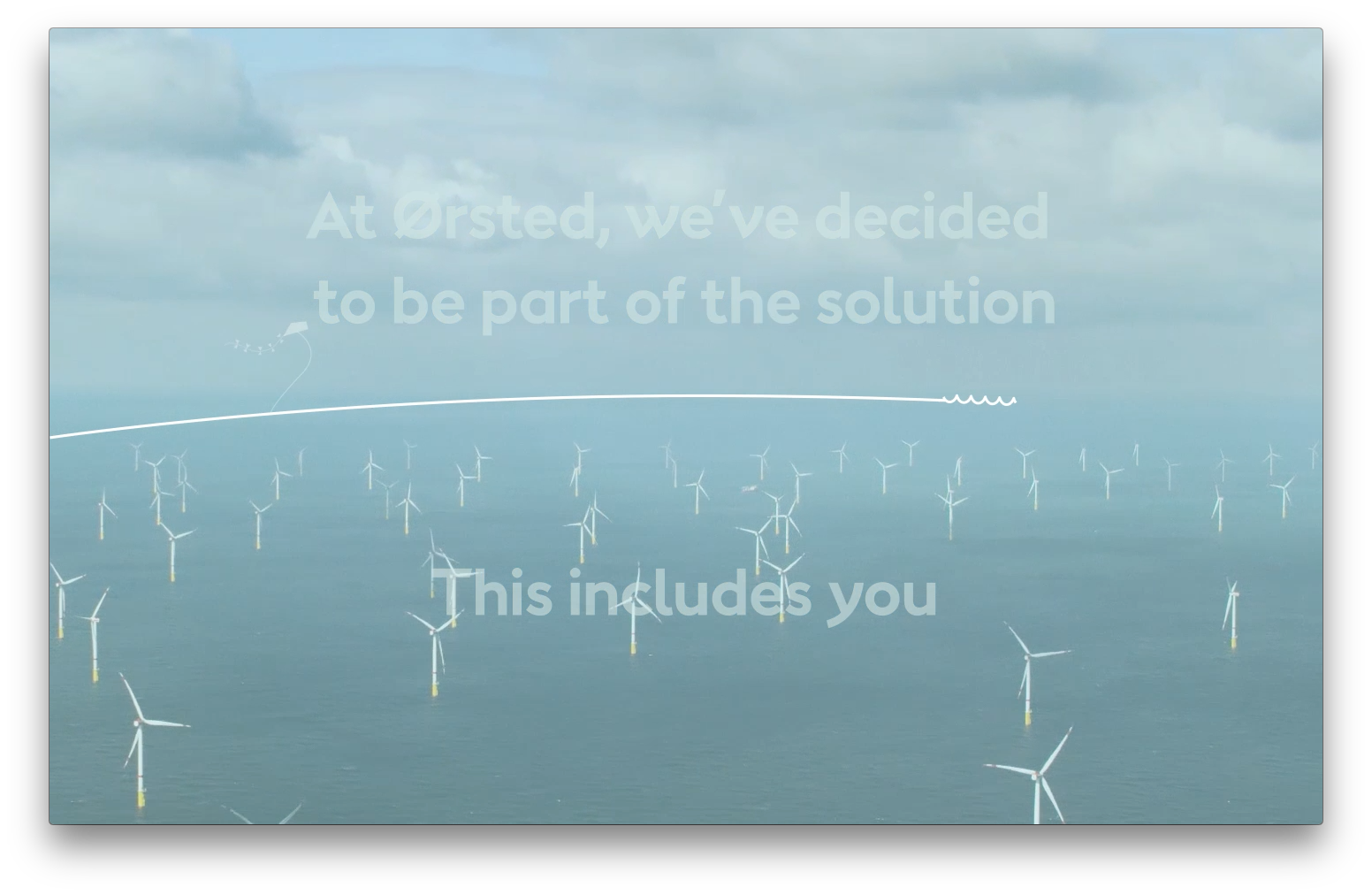
Videos
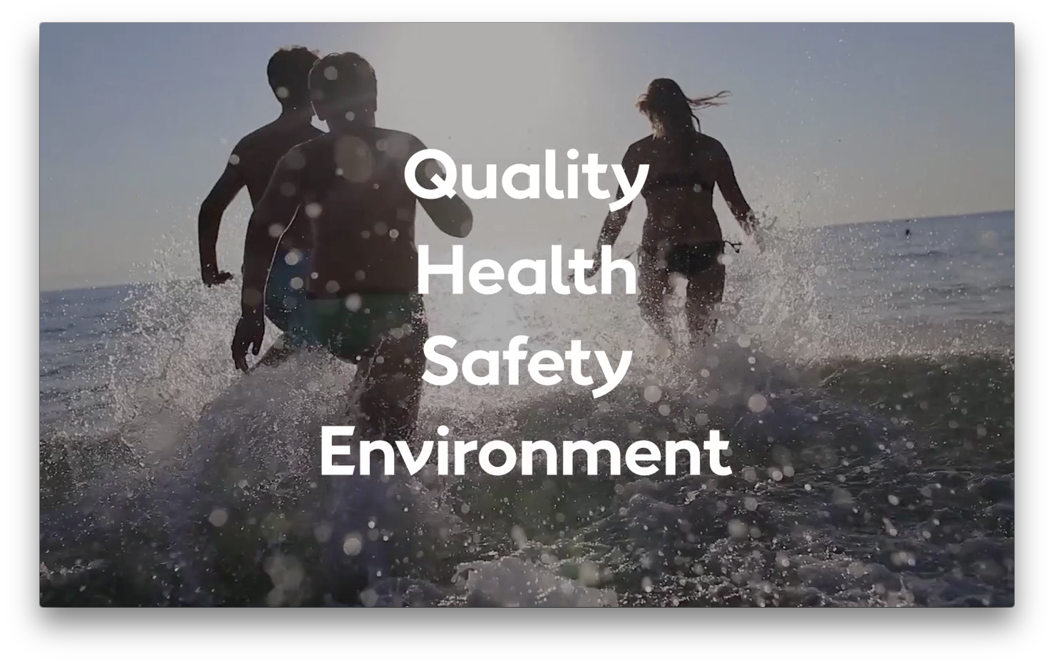
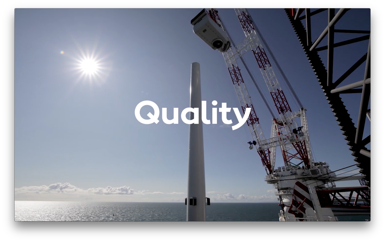
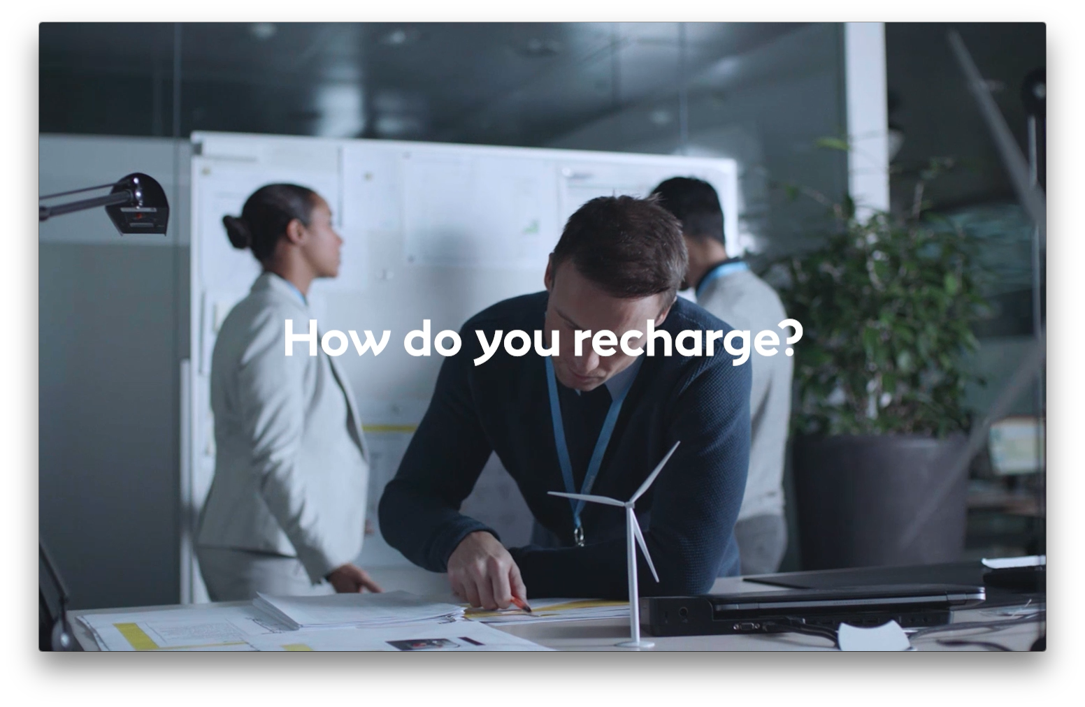
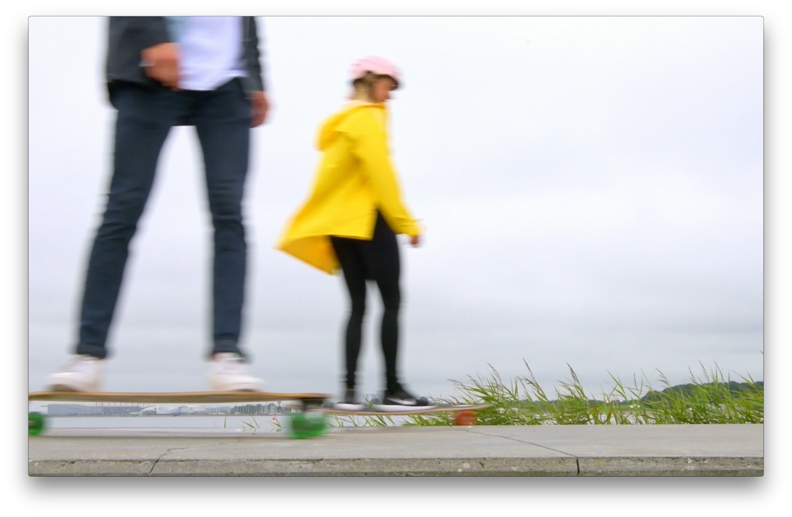
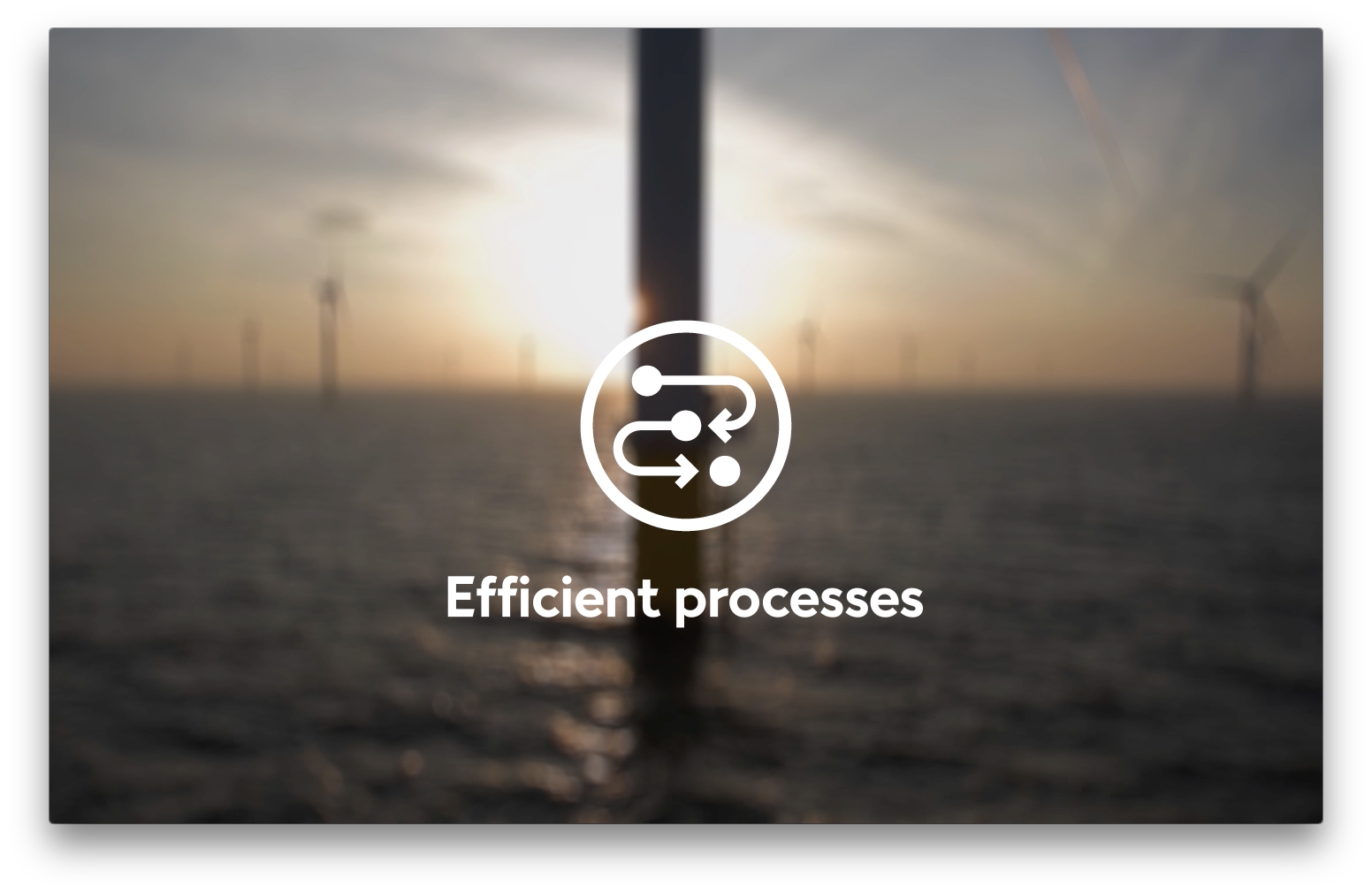
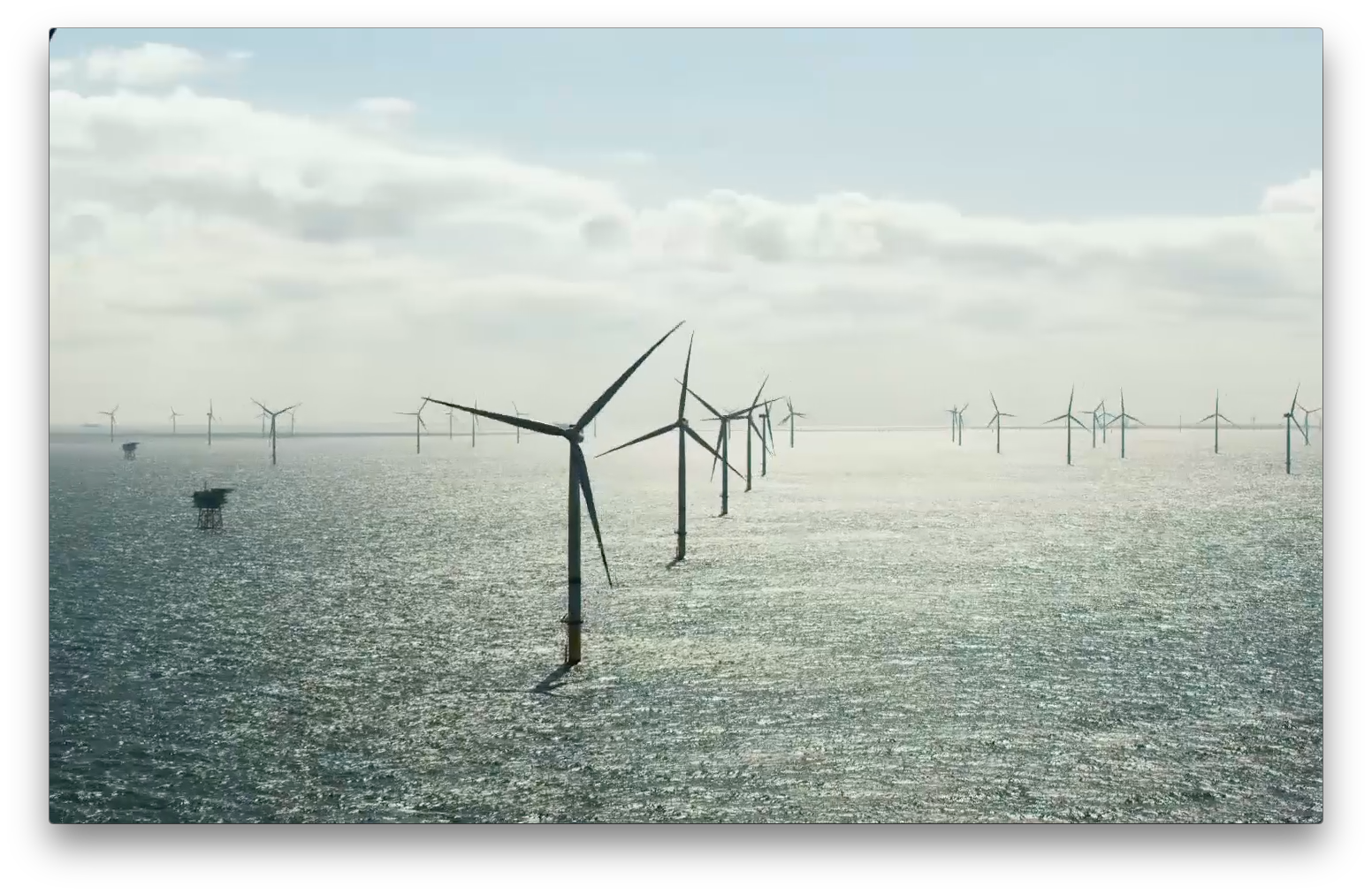
The videos are based on an easy to understand speak supported by beautiful (where possible) videoclips and simple graphics and text that emphasise what is being said, almost "karaoke-style".
We made 6 different movies. The CEO introduction, the general introduction, and one per Q, H, S and E. Visuals were largely based on existing Ørsted footage and online stock services.
The stills shown are from all of them shown in random order.


Exercises
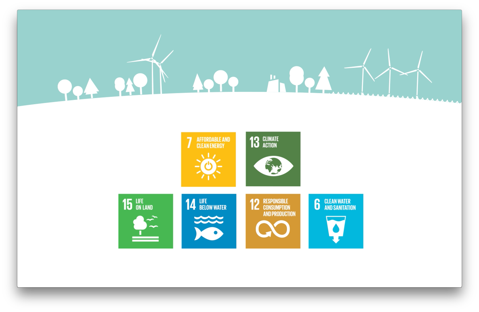
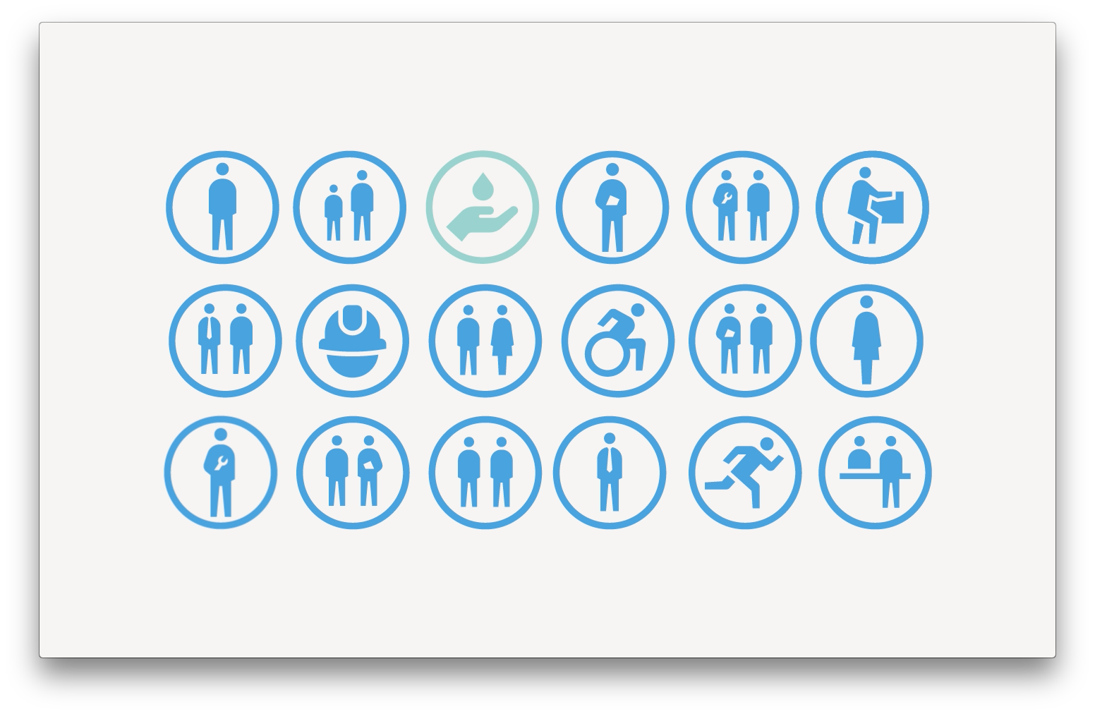
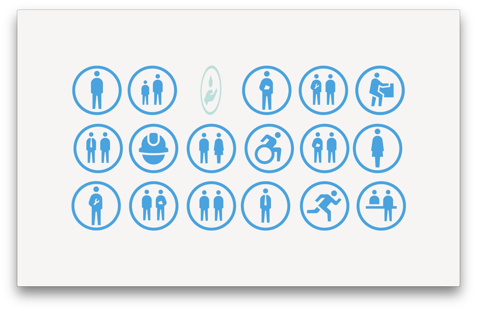
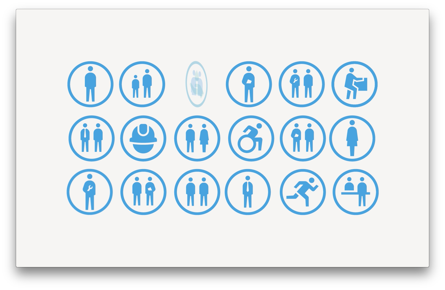
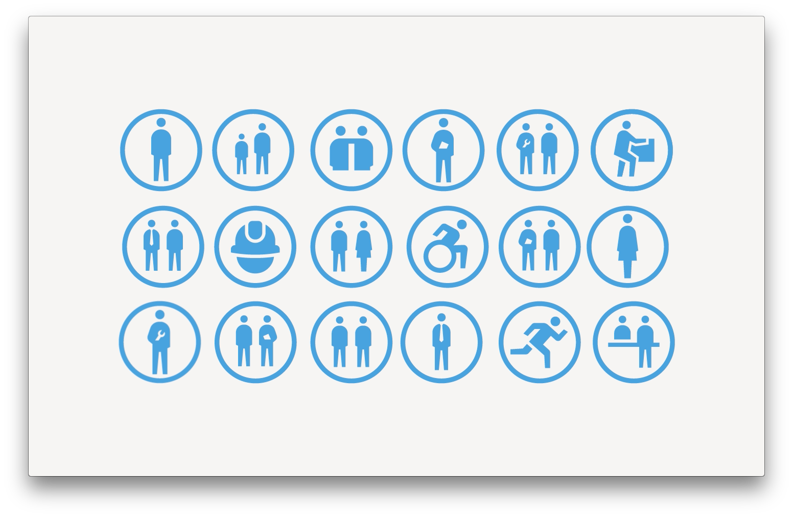
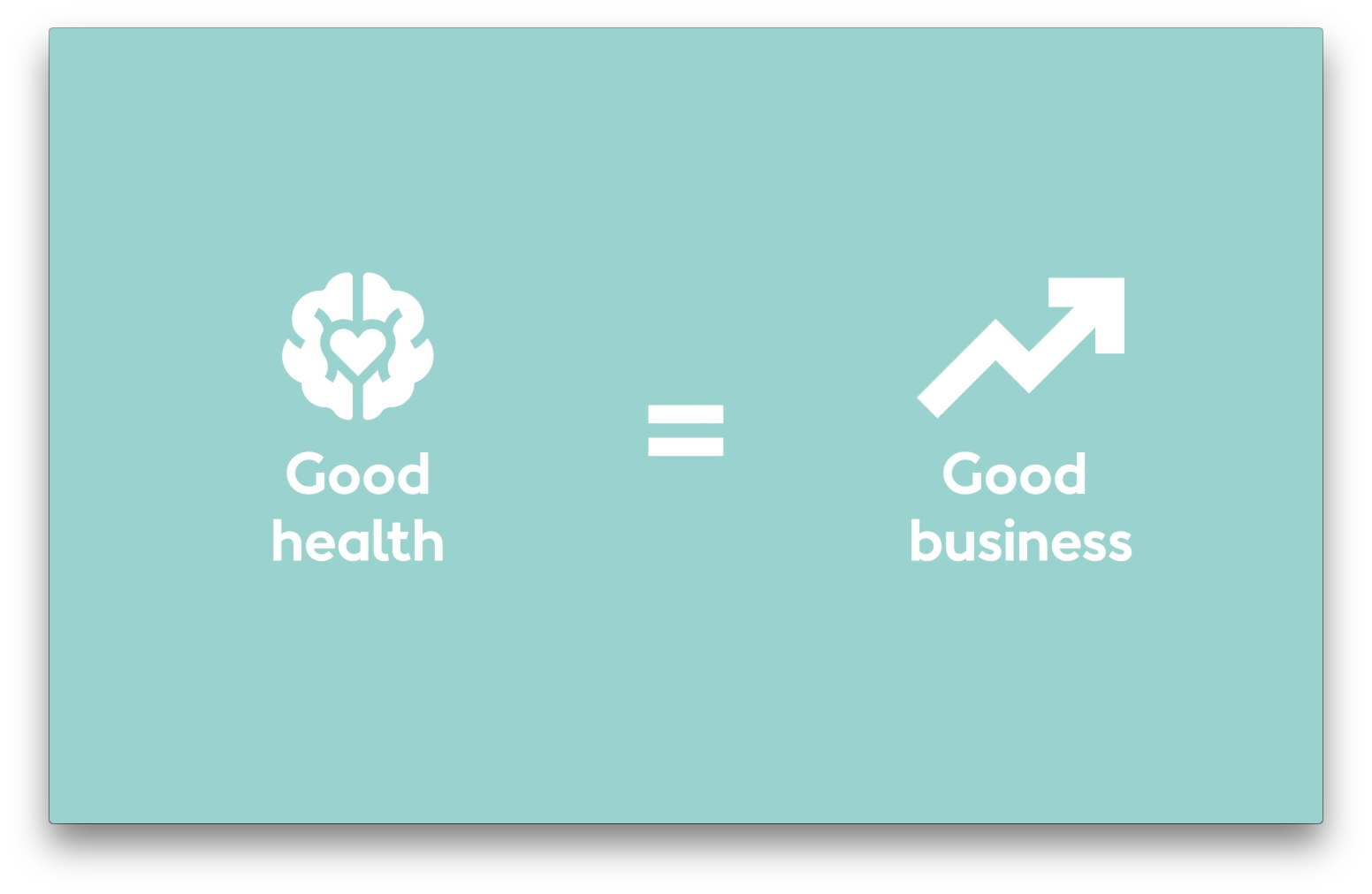
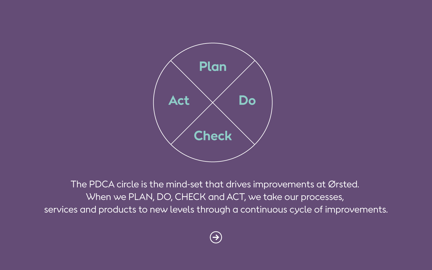
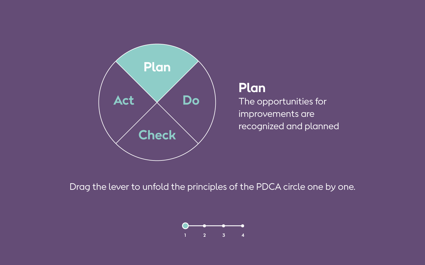
When we did this, Ørsted was very strict about their new brand and design manual. Based on Danish modern and minimalist design traditions, the manual held clean and crisp colours, a new typography 'Orsted Sans' and an emphasis on monochrome, simple graphics based on a large collection of pictograms.
They were just about to redefine their photographic style, so we decided to go with the dogma of the strict 2D monochromatic graphic style for the exercises.
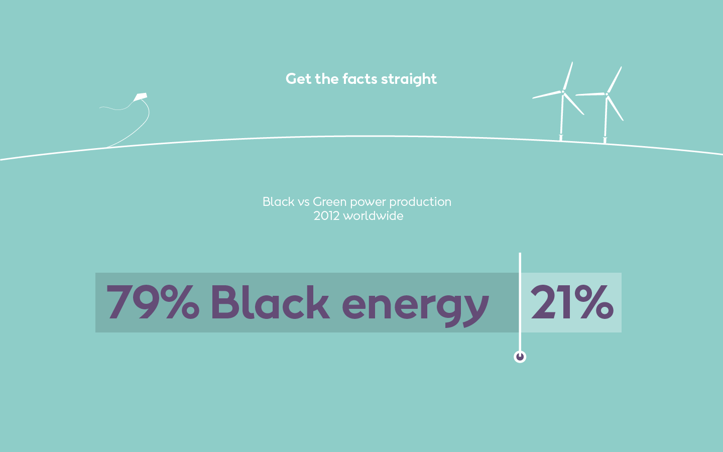
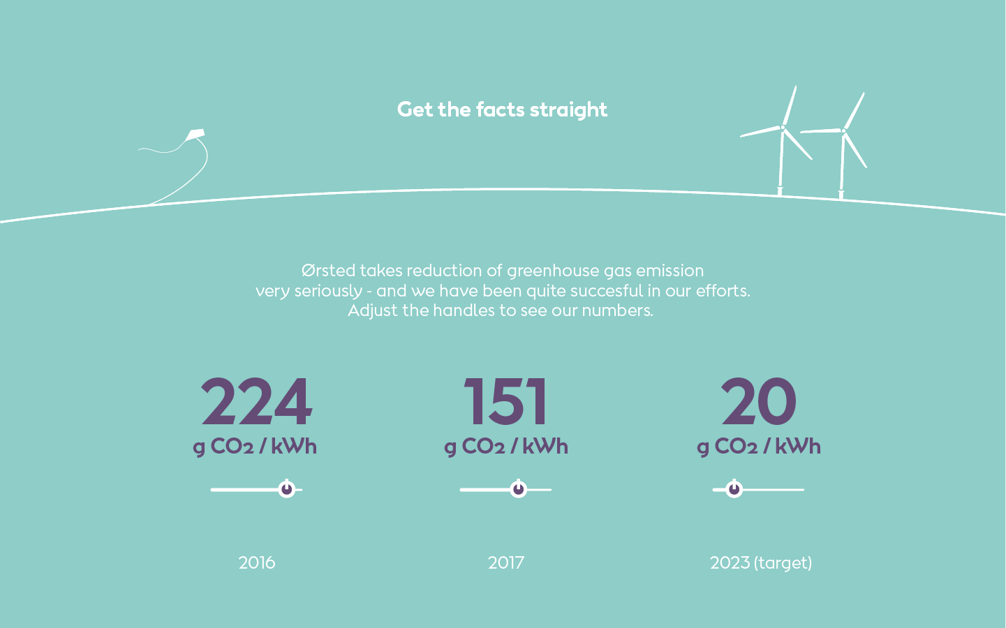
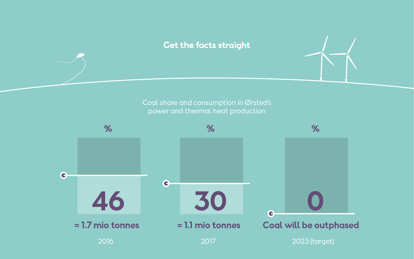
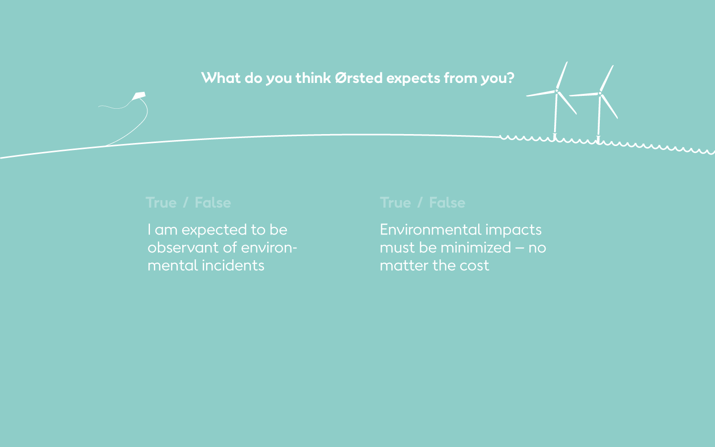
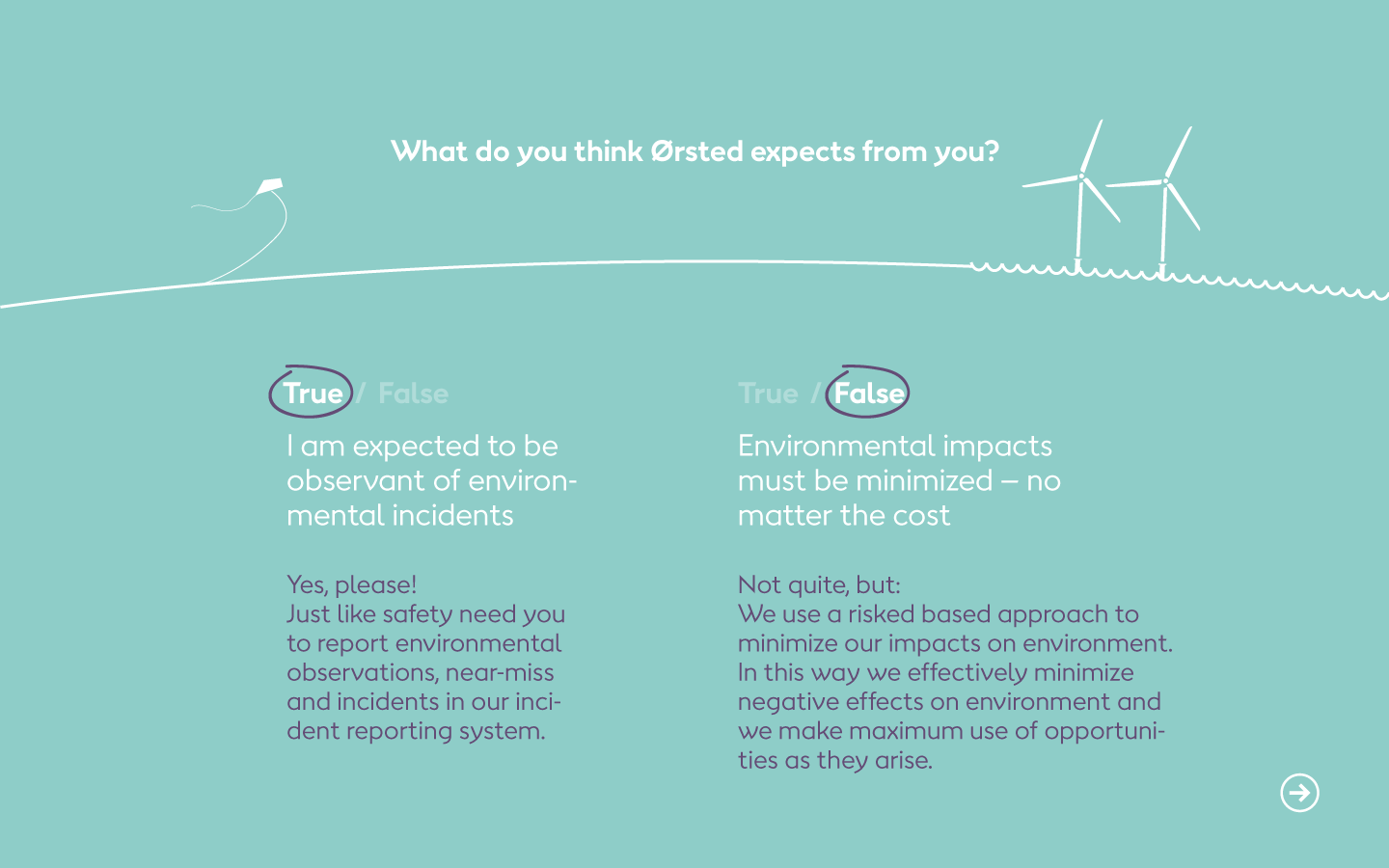
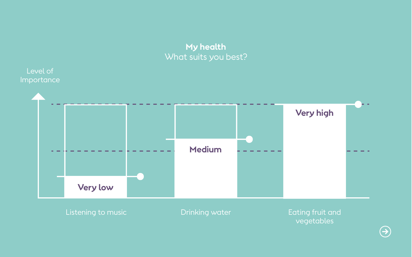
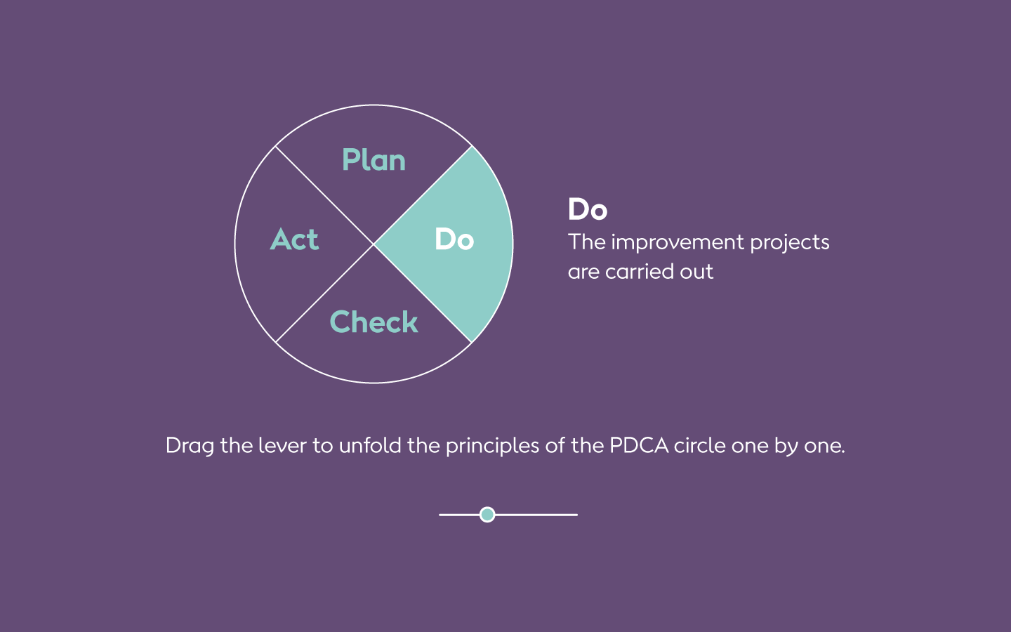
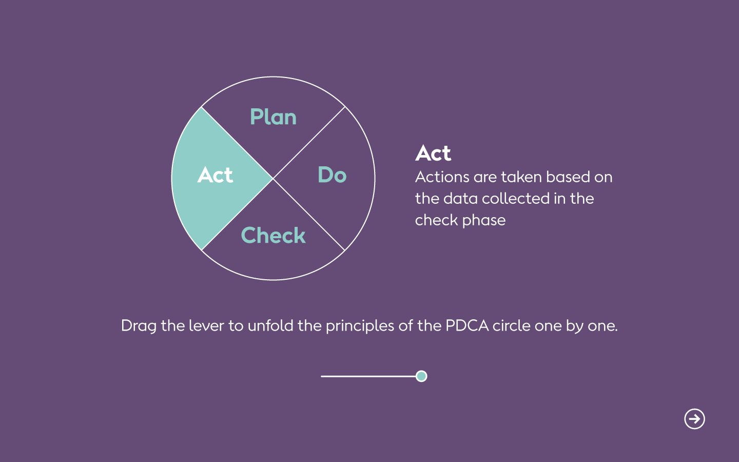
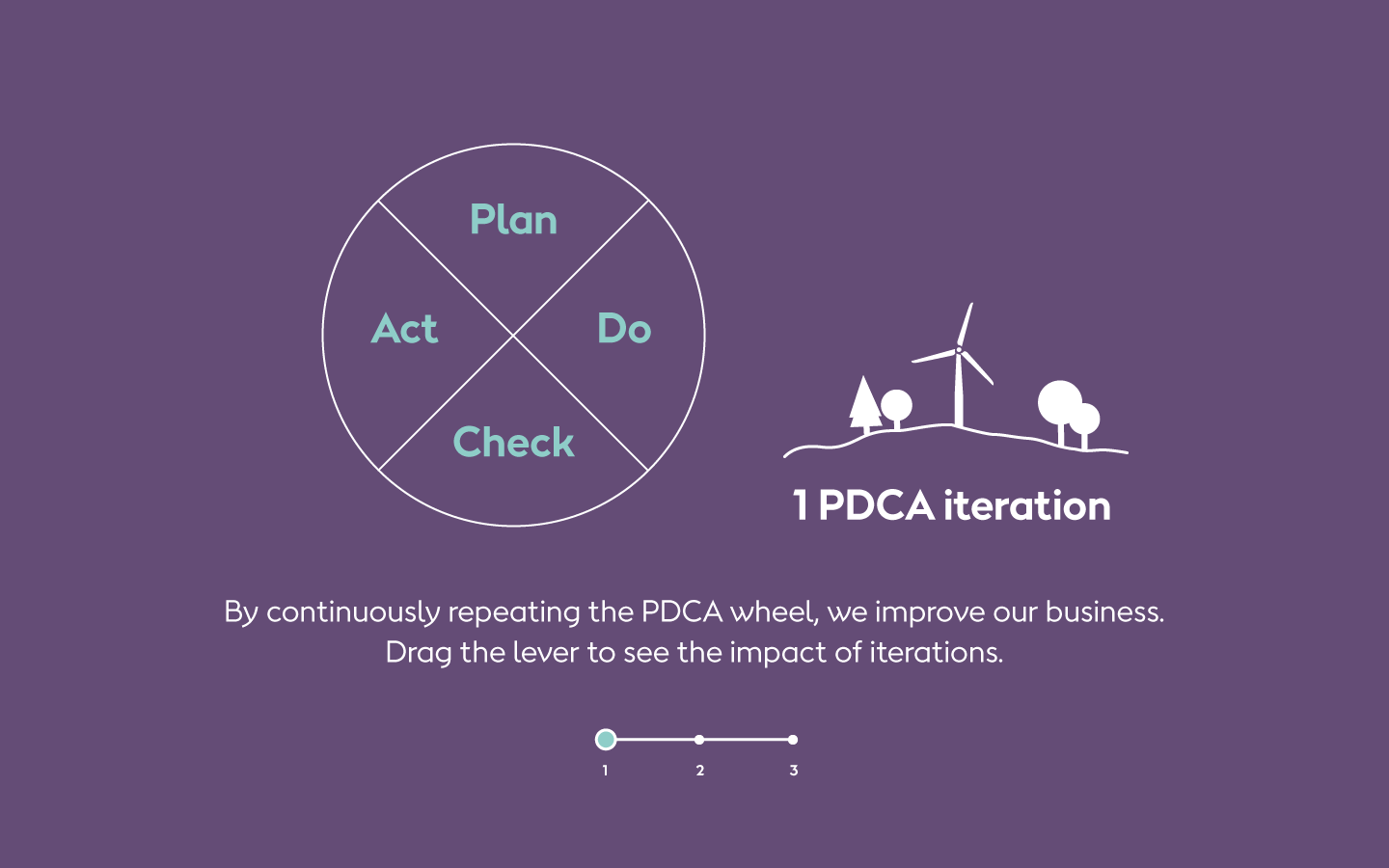
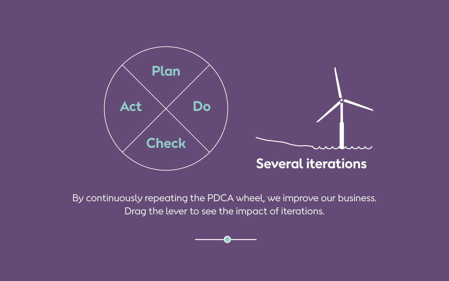
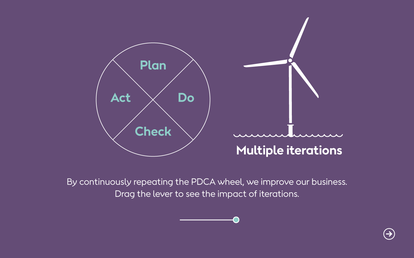
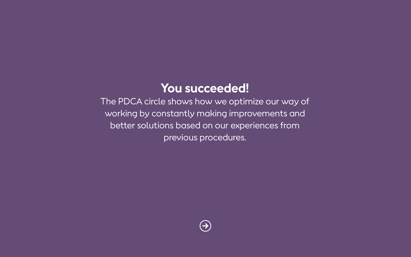
The point of the exercises is not to check that you got it right. Rather, I suggested that we make kind of an 'experimentarium' for the subject to (typically) drag a lever and see what happens. We ended up using the levers to make the subject reflect and take a stand - or to present facts: Drag the lever to change the number. When you hit the right number, it changes color. Voilá.
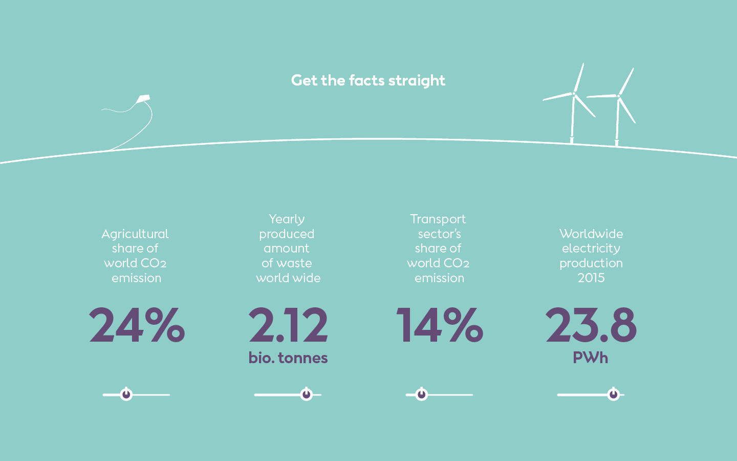
Drag the lever to find the answer
Drag the lever to find the answer

Drag the lever to find the answer
Drag the lever to find the answer
Drag the lever to find the answer


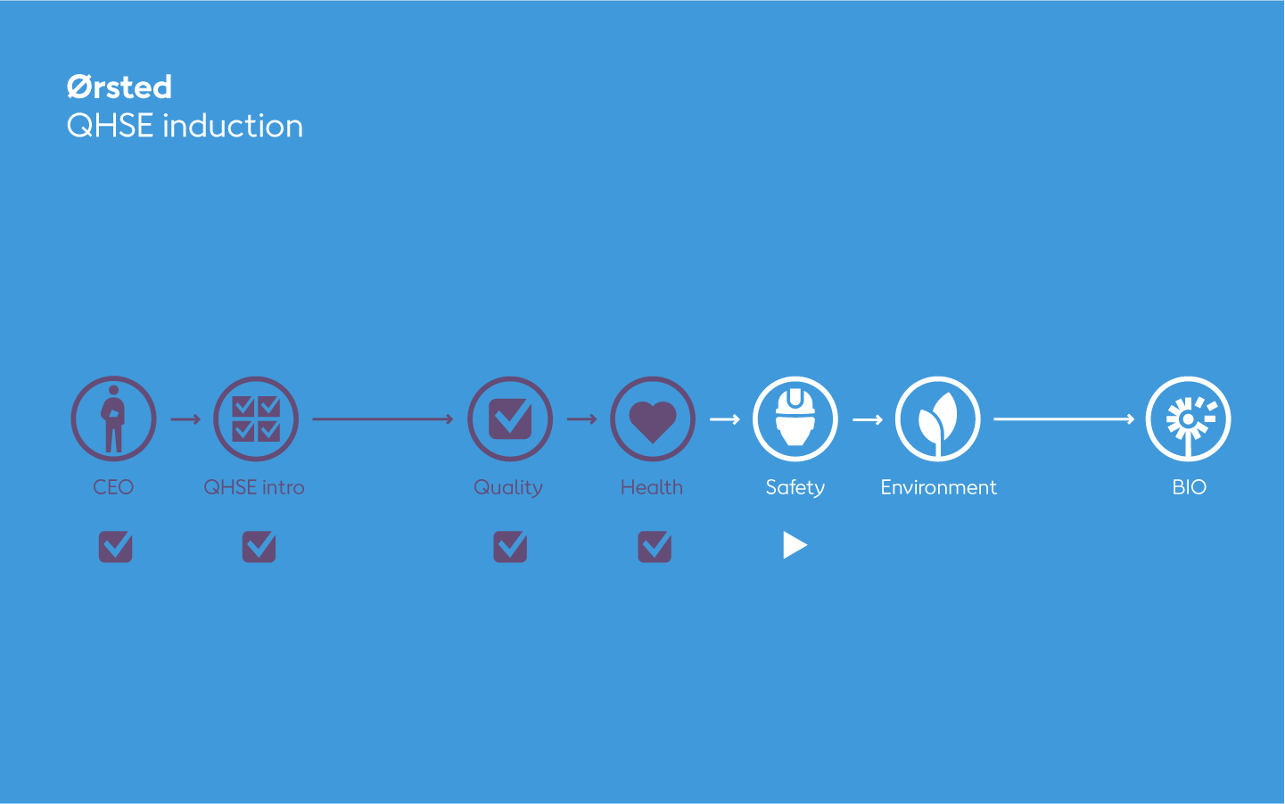
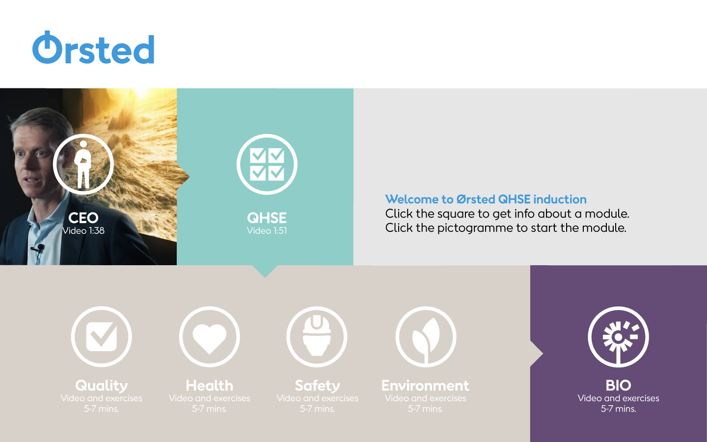
Flowchart and UI
Various suggestions
1
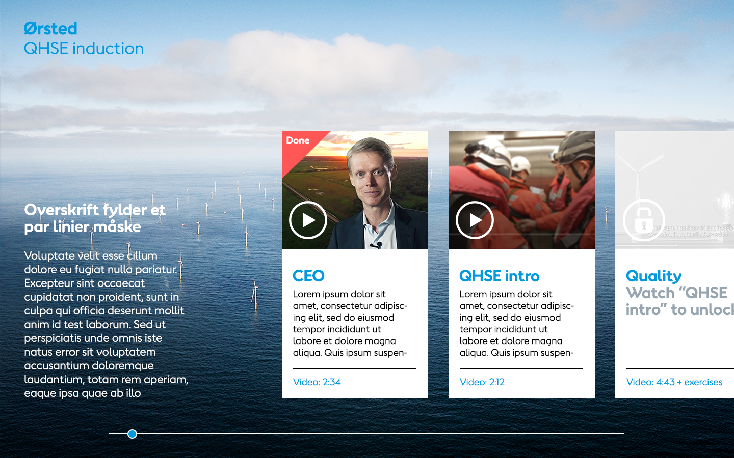
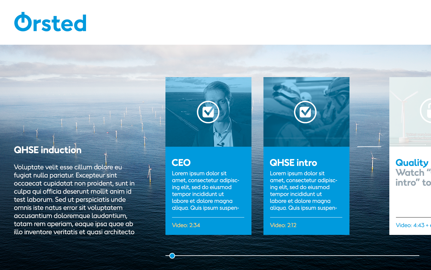
Simple UI based on Ørsted pictograms. UI is meant to take you easily through the entire induction - even if you decide to take a break for a few days.

2
Grid based UI using live screenshots from the videos to prove progression
3
UI based on photography and the possibility to add an endless row of modules, scrolling right. Two versions.